Evaluating Cream Icons for Beauty and Web Design Projects
In the expansive library of digital assets, the cream icon occupies a specific niche within makeup and beauty collections. Unlike generic cosmetic symbols that might represent lipstick or mascara, a cream symbol communicates texture, skincare, hydration, and topical application. For designers, marketers, and content creators working on templates, web interfaces, or infographics, selecting the right representation of cream is less about finding a pretty picture and more about functional communication. The distinction between a high-quality vector asset and a standard raster image often determines whether a design feels professional and adaptable or static and dated.
When sourcing these assets, professionals typically encounter two primary file formats: EPS and JPG. Understanding the practical tradeoffs between these formats is essential for efficient workflow. While the visual subject matter remains constant—a simple line element representing a jar, tube, or dollop of product—the technical delivery dictates how the asset performs across different media. This evaluation explores when to utilize specific cream icons, how they compare to alternative visual metaphors, and the decision factors involved in integrating them into broader design systems.
Distinguishing Cream Symbols from General Cosmetic Graphics
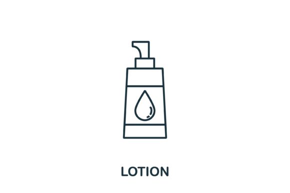
A common pitfall in beauty-related design is using interchangeable icons for distinct product categories. A cream icon is visually distinct from lotion, serum, or oil symbols, and this specificity matters for user comprehension. In an infographic detailing a skincare routine, accuracy builds trust. A cream symbol typically features a wider vessel with an open lid or a spatula, suggesting a thicker viscosity and a ritualistic application process. Conversely, a pump bottle suggests liquid lotion, while a dropper indicates serum.
Choosing a dedicated cream icon over a generic "skincare" placeholder offers several advantages:
- Semantic Clarity: Users instantly recognize the product type without needing accompanying text labels, which is crucial for minimalist web design.
- Texture Communication: Simple line elements can imply thickness through the shape of the container or the depiction of the product surface, distinguishing moisturizers from toners.
- Category Segmentation: In e-commerce navigation or comparison charts, specific icons help users filter and find products faster than generalized imagery.
However, there are situations where a specific cream icon may be too granular. If the content addresses general wellness or holistic beauty, a more abstract organic shape or a stylized leaf might serve better than a literal product container. The decision hinges on whether the goal is product identification or mood setting. For instructional content, ingredient breakdowns, or shopping guides, the literal cream symbol is superior. For brand storytelling or atmospheric backgrounds, alternatives may offer greater flexibility.
Vector (EPS) vs. Raster (JPG): Technical Tradeoffs
The availability of both EPS and JPG files for a single cream icon asset addresses different stages of the production pipeline. Evaluating which format to deploy requires understanding the end-use environment rather than personal preference.
The Case for EPS Files
Encapsulated PostScript (EPS) files are vector-based, meaning they are constructed from mathematical paths rather than pixels. For a simple line element cream symbol, this is generally the preferred master format. Vectors allow for infinite scaling without degradation, making the same file suitable for a 16-pixel favicon and a large-format trade show banner. More importantly, EPS files are editable. Designers can adjust stroke weights to match existing typography, change colors to align with brand guidelines, or combine the cream icon with other elements to create composite graphics.
The tradeoff is accessibility. Editing an EPS file requires specialized software like Adobe Illustrator or Affinity Designer. Non-designers or stakeholders reviewing proofs cannot easily open or manipulate these files. Furthermore, vectors are not natively supported in all web browsers without conversion to SVG, requiring an extra step in the web development workflow.
The Utility of JPG Files
JPG versions serve as immediate-use assets. They are universally compatible, viewable in any browser, and easily inserted into documents, presentations, or basic website builders without technical friction. For a stakeholder creating a quick internal presentation or a social media manager drafting a post in a template tool, the JPG is often the pragmatic choice.
However, JPGs come with significant limitations for professional design. They have fixed resolutions; scaling up results in pixelation and blurriness. They also lack transparency support, meaning the cream icon will always sit within a rectangular background box unless manually removed. This makes JPGs unsuitable for overlaying on colored backgrounds or integrating seamlessly into complex UI layouts. They function best as reference images or final-output assets for non-critical applications.
Stylistic Fit: Simple Line Elements vs. Detailed Illustrations
Beyond file format, the artistic style of the cream icon influences its effectiveness. The "simple line element" aesthetic has become dominant in modern web design and infographics for specific functional reasons, but it is not universally appropriate.
Minimalist Line Art: These icons prioritize silhouette and negative space. They excel in user interfaces where cognitive load must be minimized. A thin-line cream jar allows the eye to scan a menu or feature list quickly without getting distracted by shading or detail. This style pairs well with clean sans-serif typography and ample whitespace. It is the safest choice for responsive web design because it remains legible at very small sizes.
Detailed or Shaded Illustrations: Alternatively, some cream icons include gradients, shadows, or realistic rendering. These are stronger choices for hero sections, packaging mockups, or educational diagrams where the tactile quality of the product needs to be emphasized. However, they compete visually with text and photography. Using a detailed cream icon in a dense navigation bar or a crowded infographic can create visual noise and reduce readability.
When comparing options, consider the surrounding visual ecosystem. If the template or website already utilizes heavy photography or complex patterns, a simple line cream icon provides necessary visual relief. If the design is stark and text-heavy, a slightly more rendered icon might add needed warmth and approachability. Consistency is paramount; mixing line-art cream icons with photorealistic lipstick icons creates a disjointed user experience that undermines professional credibility.
Integration Considerations for Templates and Infographics
Cream icons rarely exist in isolation. Their value is realized when integrated into larger systems like presentation templates, website themes, or data visualizations. When evaluating an asset pack or individual download, consider how the cream symbol interacts with other components.
For infographics, the icon must function as a data anchor. It should be sized proportionally to other category icons to avoid implying hierarchy where none exists. If the cream icon is significantly larger or more detailed than the cleanser or toner icons next to it, users may subconsciously assume it is the most important step. Uniform stroke width and bounding box dimensions are critical metrics for comparison during the selection process.
In web design templates, the cream icon often serves as a navigational cue or feature highlight. Here, adaptability is key. An EPS source file allows developers to generate multiple variants: a solid fill version for active states, an outline version for inactive states, and perhaps a simplified version for mobile views. Pre-made JPGs cannot offer this interactive versatility. When choosing resources for web projects, prioritize assets that provide the vector source even if you currently only need a static image, as future requirements will likely demand adaptation.
For print templates such as brochures or packaging inserts, resolution becomes the deciding factor. While vectors scale infinitely, any accompanying raster textures within the icon must be high-resolution (typically 300 DPI at print size). A cream icon that looks crisp on screen may appear muddy in print if it relies on low-res effects. Always verify the technical specifications before committing an asset to a print production workflow.
Making the Final Selection Decision
Ultimately, the right cream icon depends on balancing aesthetic alignment with technical necessity. There is no single best option, only the most appropriate fit for the specific project constraints.
Choose a vector EPS line-art cream icon when:
- You are building a scalable design system or responsive website.
- Brand colors require exact matching and customization.
- The icon will be used across multiple sizes and media types.
- You need to maintain consistency with other minimalist UI elements.
Opt for a JPG or raster alternative when:
- The asset is for a one-off presentation or document with no future reuse.
- You lack access to vector editing software and need immediate implementation.
- The design context is strictly photographic or textured, making vector lines feel out of place.
- The icon serves merely as a decorative accent rather than a functional interface element.
By approaching the selection process with clear criteria regarding format, style, and integration, designers and researchers can ensure that the cream icon enhances rather than hinders the communication goals. Whether illustrating a complex skincare regimen or simply labeling a product category, the effectiveness of the symbol lies in its precision, adaptability, and alignment with the broader visual strategy. Investing time in evaluating these factors upfront prevents costly redesigns and ensures a cohesive, professional outcome across all touchpoints.